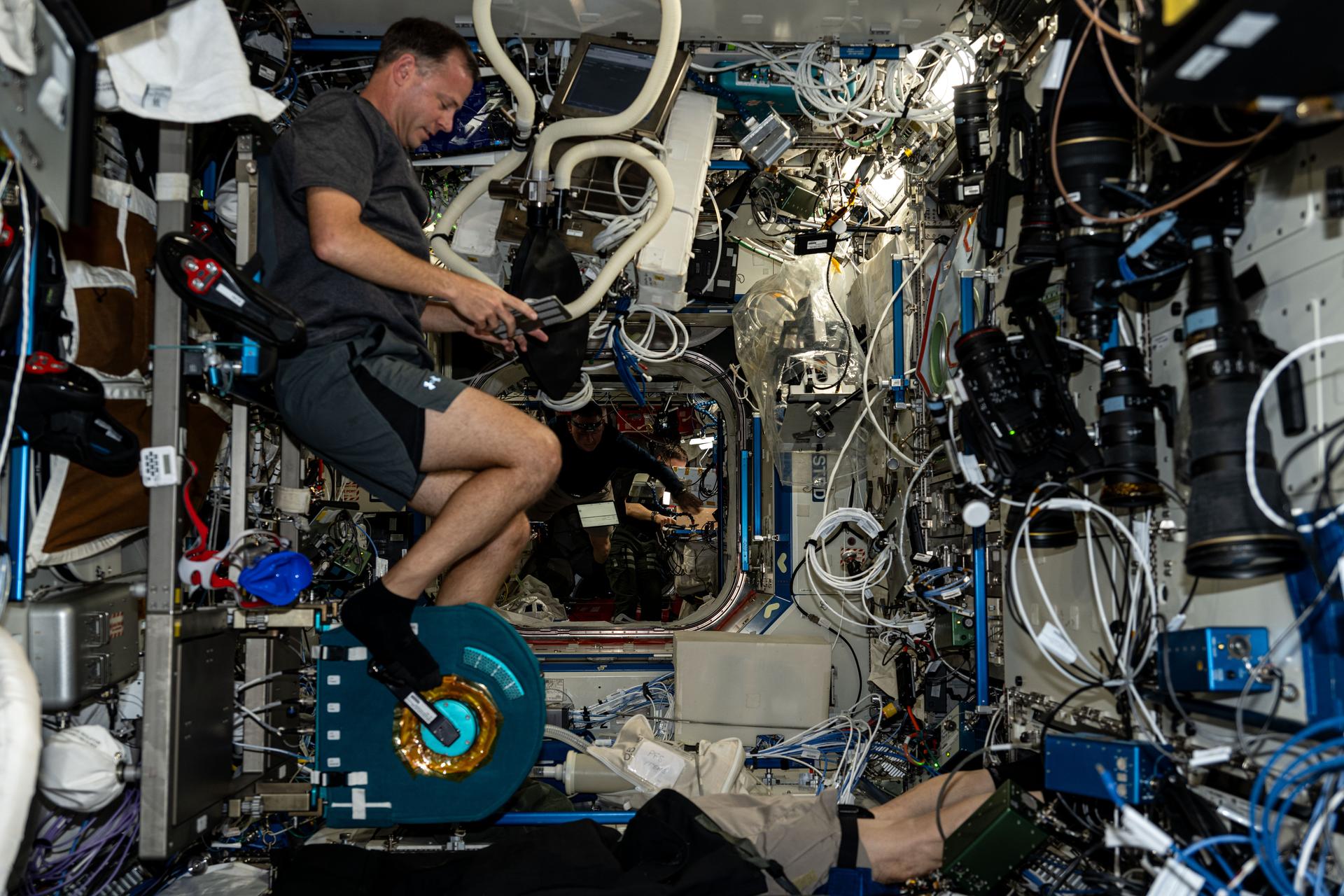
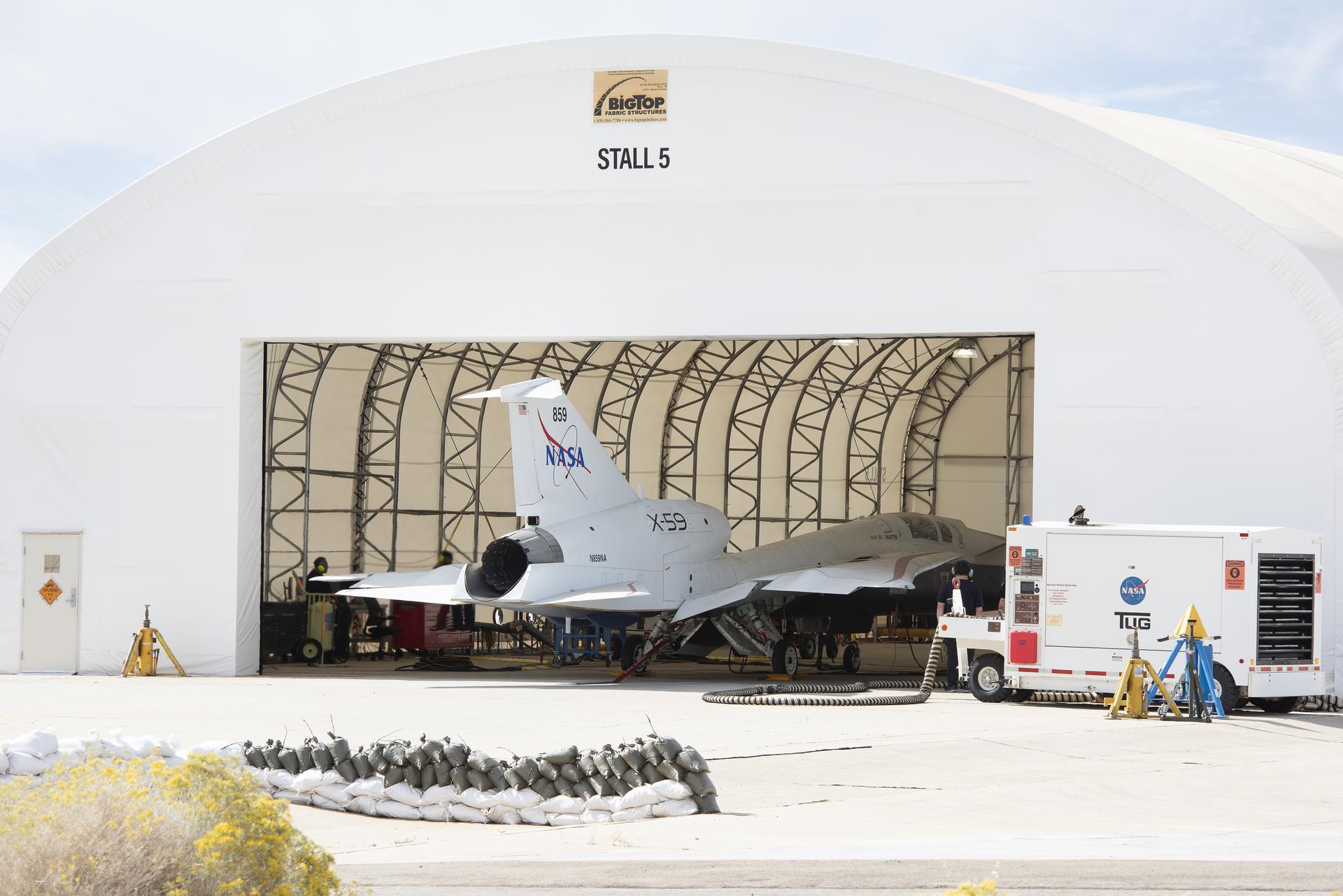
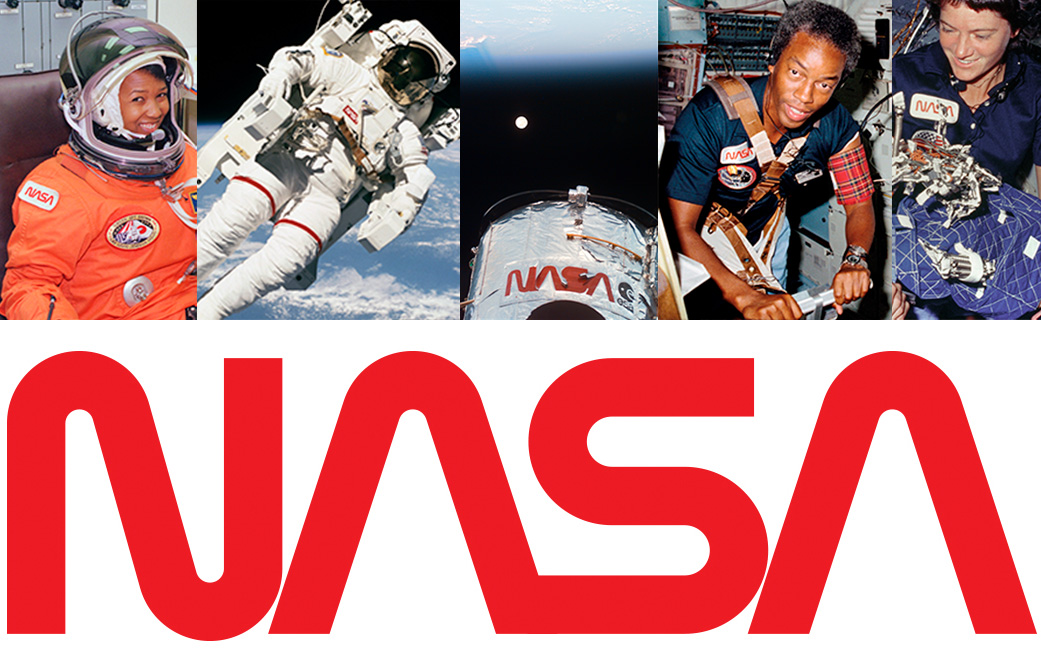
The original NASA insignia is one of the most powerful symbols in the world. A bold, patriotic red chevron wing piercing a blue sphere, representing a planet, with white stars, and an orbiting spacecraft. Today, we know it as “the meatball.” However, with 1970’s technology, it was a difficult icon to reproduce, print, and many people considered it a complicated metaphor in what was considered, then, a modern aerospace era.
Enter a cleaner, sleeker design born of the Federal Design Improvement Program and officially introduced in 1975. It featured a simple, red unique type style of the word NASA. The world knew it as “the worm.” Created by the firm of Danne & Blackburn, the logo was honored in 1984 by President Reagan for its simplistic, yet innovative design.
NASA was able to thrive with multiple graphic designs. There was a place for both the meatball and the worm. However, in 1992, the 1970s brand was retired – except on clothing and other souvenir items – in favor of the original late 1950s graphic.
Until today.
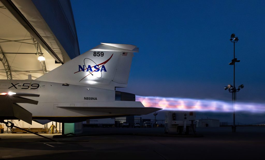
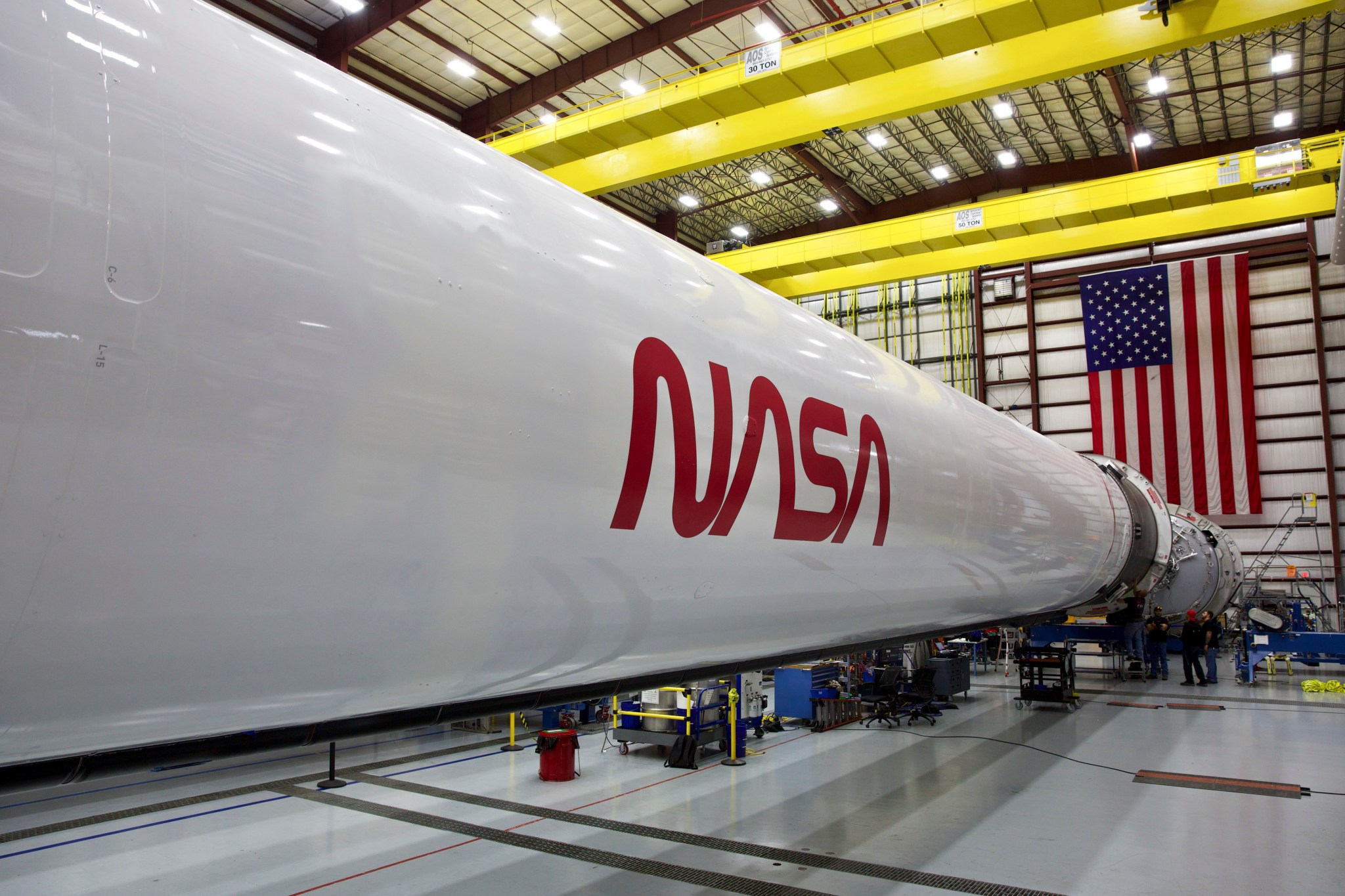
The worm is back. And just in time to mark the return of human spaceflight on American rockets from American soil.
The retro, modern design of the agency’s logo will help capture the excitement of a new, modern era of human spaceflight on the side of the Falcon 9 launch vehicle that will ferry astronauts to the International Space Station as part of the Demo-2 flight, now scheduled for mid- to late May.
And there’s a good chance you’ll see the logo featured in other official ways on this mission and in the future. The agency is still assessing how and where it will be used, exactly.
It seems the worm logo wasn’t really retired. It was just resting up for the next chapter of space exploration.
And don’t worry, the meatball will remain NASA’s primary symbol.
For more information about NASA’s Commercial Crew Program, visit:
https://www.nasa.gov/exploration/commercial/crew/index.html
For past stories about NASA’s symbols, visit:
https://www.nasa.gov/audience/forstudents/5-8/features/symbols-of-nasa.html
For the original 1976 NASA Graphics Standards Manual, visit:
